FOXBIRD WINE CO.
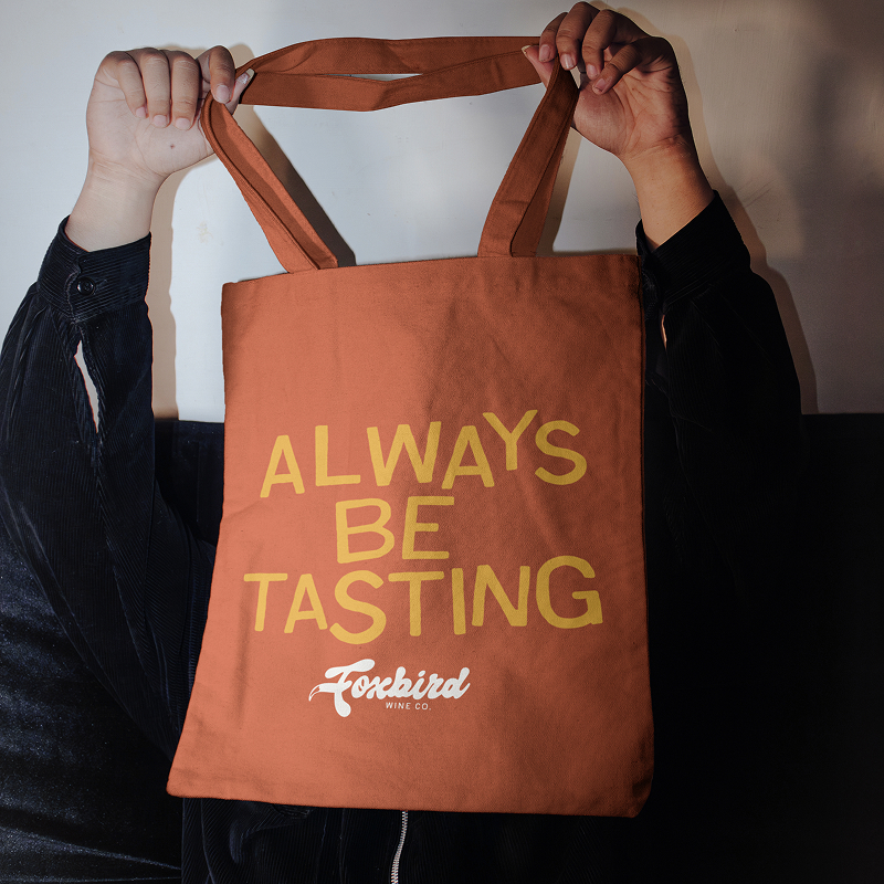
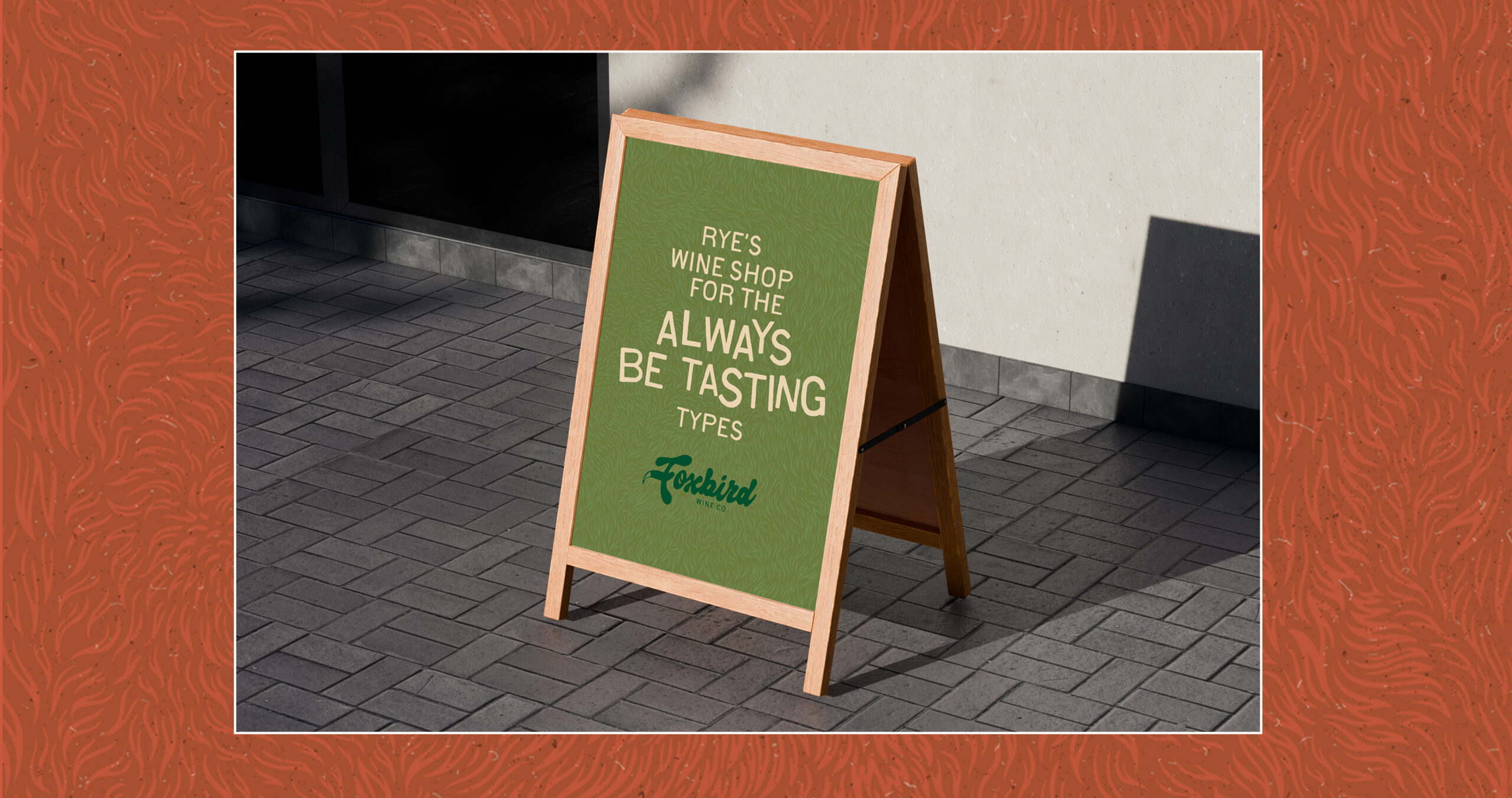
The wine shop for the always be tasting types.
“If you don’t see it, let me know.”
That’s something Dave says a lot behind the counter at Foxbird Wine Co., the neighborhood wine shop on Rye, New York’s main downtown street. The name is personal: Dave’s favorite animal is the fox, his wife Meredith’s is the bird, she’s an avid birder, and the fox even has a name behind the scenes, Machi, a nod to Machiavelli’s The Prince. It’s the kind of specific, human detail that tells you everything about how Dave runs the shop: no wine-speak, no pretense, just real conversations that help someone find a bottle they’ll actually love, whether they’re a lifelong collector or just curious enough to try something new.
Second Sight partnered with Dave and Meredith to build Foxbird a brand identity from the ground up, coinciding with the change in ownership. Through hands on workshops and multiple rounds of creative exploration, we worked to translate who Foxbird really is into a visual identity and voice that felt just as unpretentious and welcoming as the shop itself.
Situation:
A change in ownership meant Foxbird needed more than a new coat of paint. It needed an identity that could carry it into its next chapter, one that matched the personality already living behind the counter and the story behind its name. The shop had real relationships and a loyal, growing customer base, but nothing in its branding yet said who Foxbird actually was or why people kept coming back.
Realization:
We started where every good brand should, not with a logo, but with a conversation. A brand workshop with Dave and Meredith surfaced the real insight: Foxbird customers aren’t looking for a wine expert to impress them, they’re looking for a guide who’s already done the hard work of cutting through the industry’s noise to find the good stuff. That’s where the name itself became the whole strategy, not just a pairing of two favorite animals.
Dave’s fox is pulled straight from Machiavelli, specifically the idea that cleverness, not just strength, is what keeps you out of traps. In wine, that means seeing through the snooty posturing and recognizing the real good sourcing before a customer ever has to. Meredith’s bird, true to her own love of birding, brings the opposite energy: a wide-open, world-traveling perspective, the same instinct that leads Foxbird to stock small, hard-to-find producers nobody else is carrying. Clever and perceptive. Curious and far-reaching. Put those two instincts together and you get exactly what Foxbird does for its customers: already conquered every challenge standing between them and the right bottle, before they ever walk through the door.
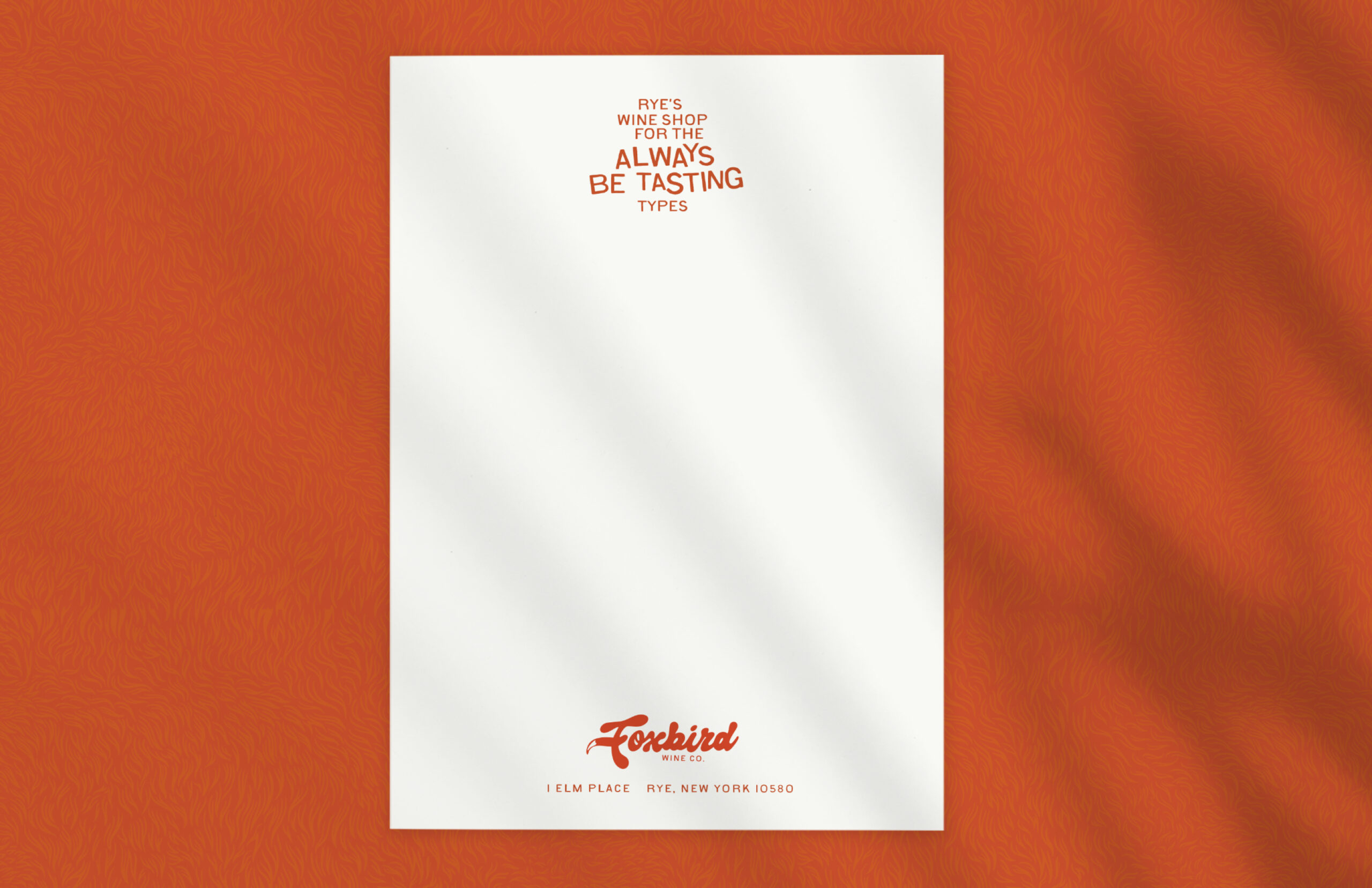
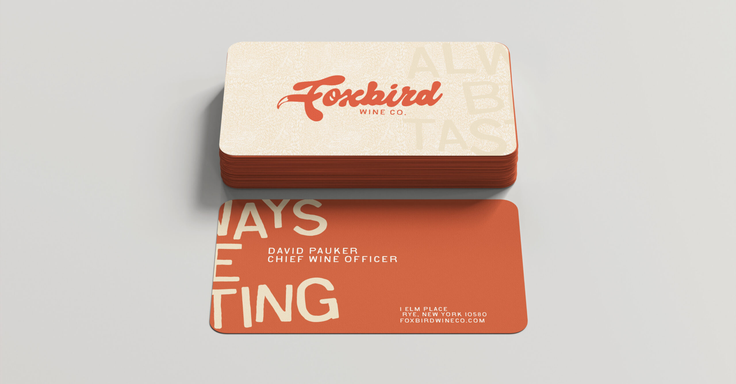
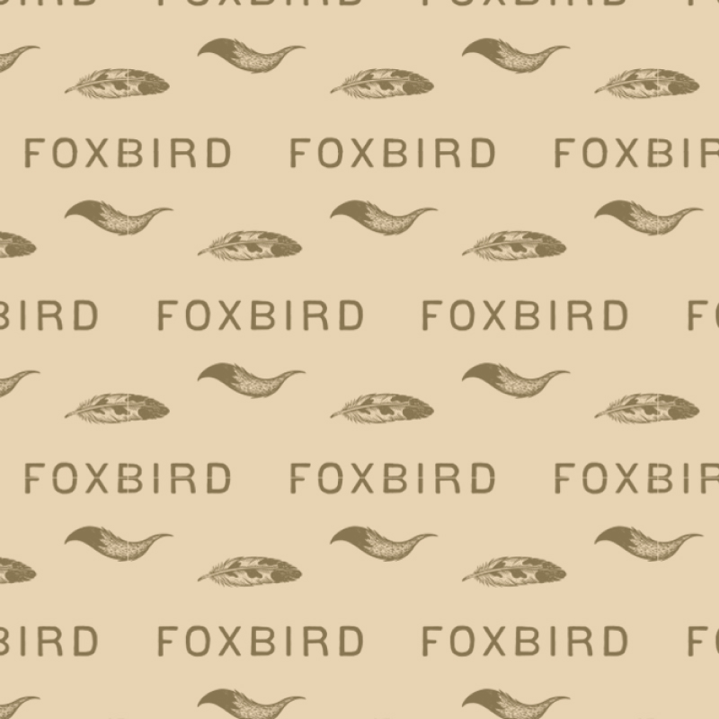
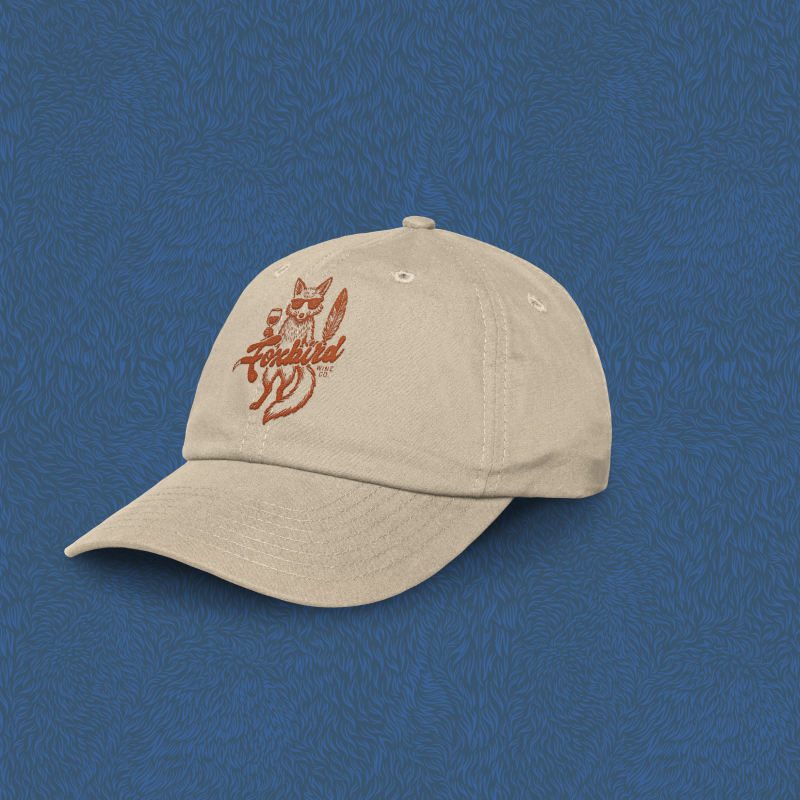
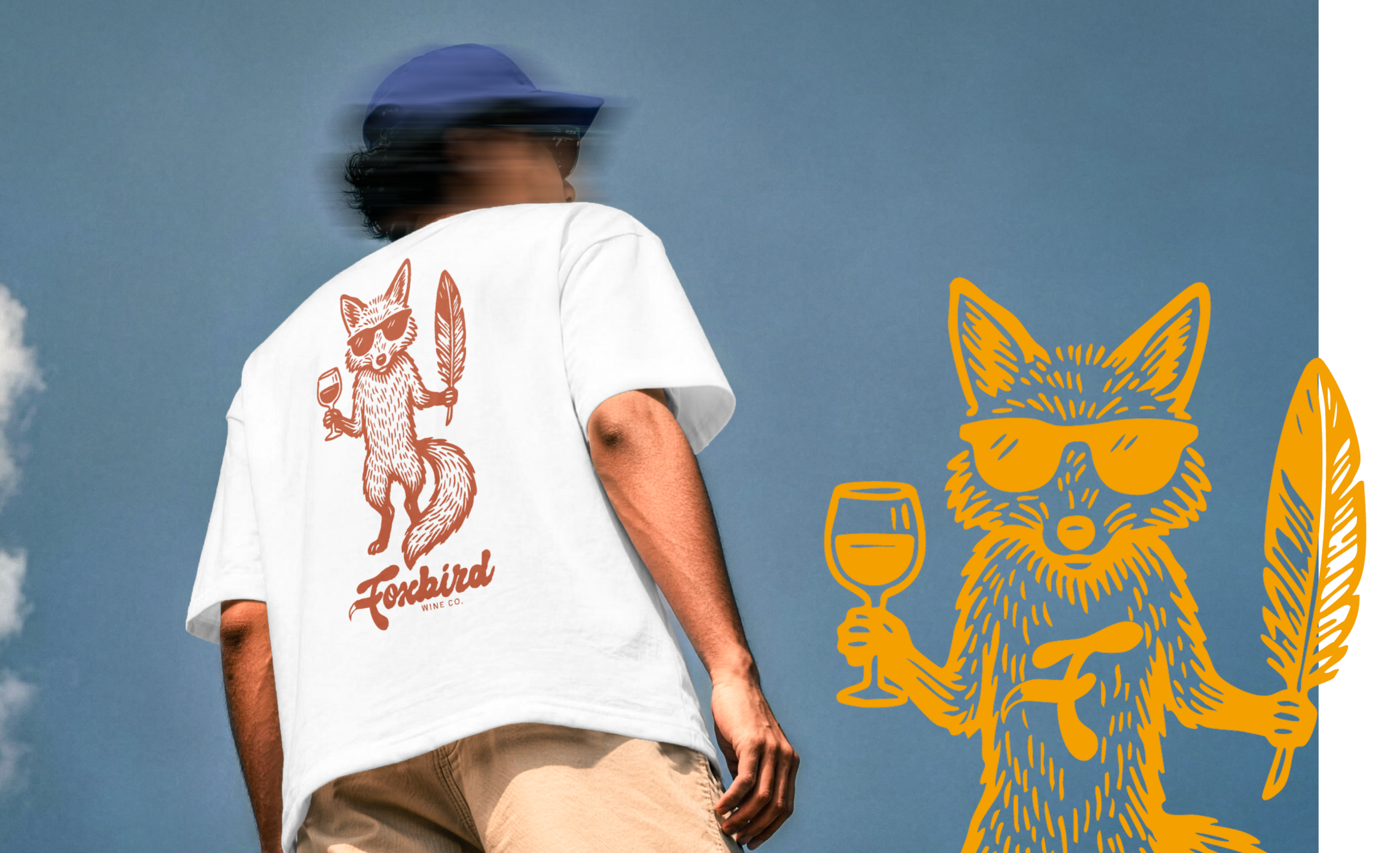
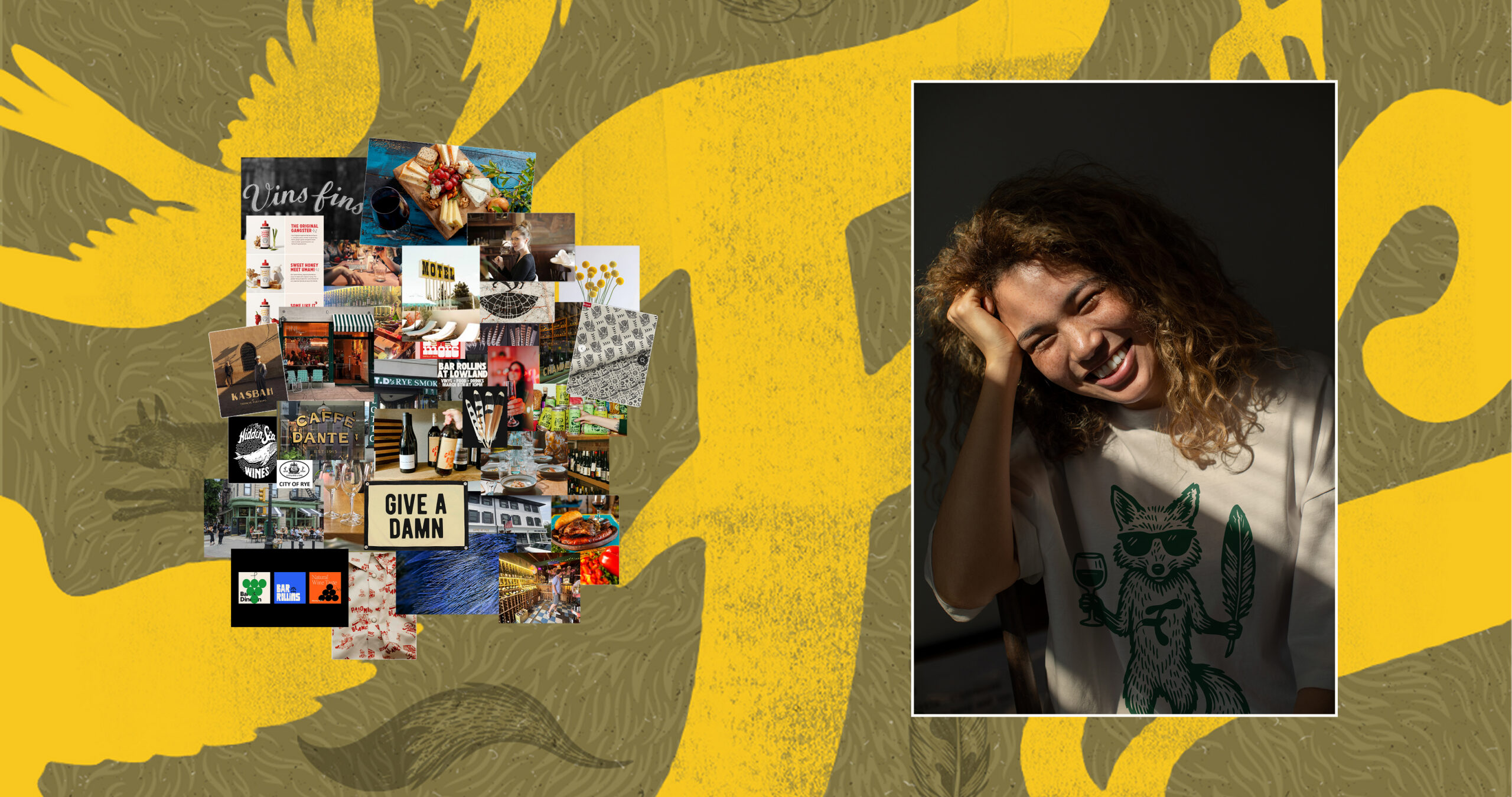
This is exactly the kind of branding assignment we can’t get enough of. We started with mood boards pulling inspiration from our favorite brands, colors, and patterns, borrowing ideas from the historical to the funky and contemporary, to find what actually resonated with Dave and Meredith and what didn’t. From there, we brought the fox and bird to life, kept true to their real selves rather than merged into one mythical creature, through a bold, hand-drawn illustrative style that felt playful instead of precious.
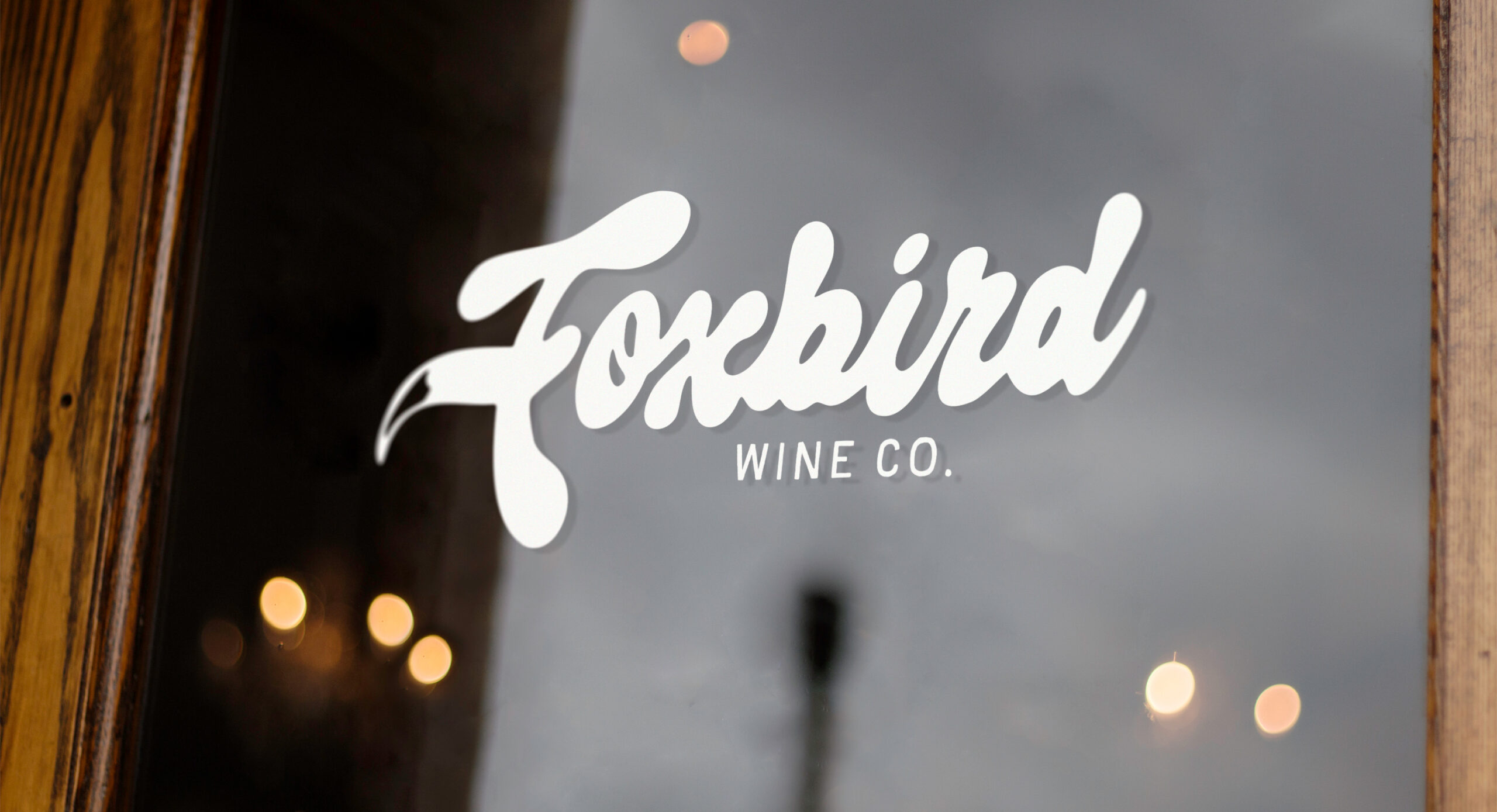
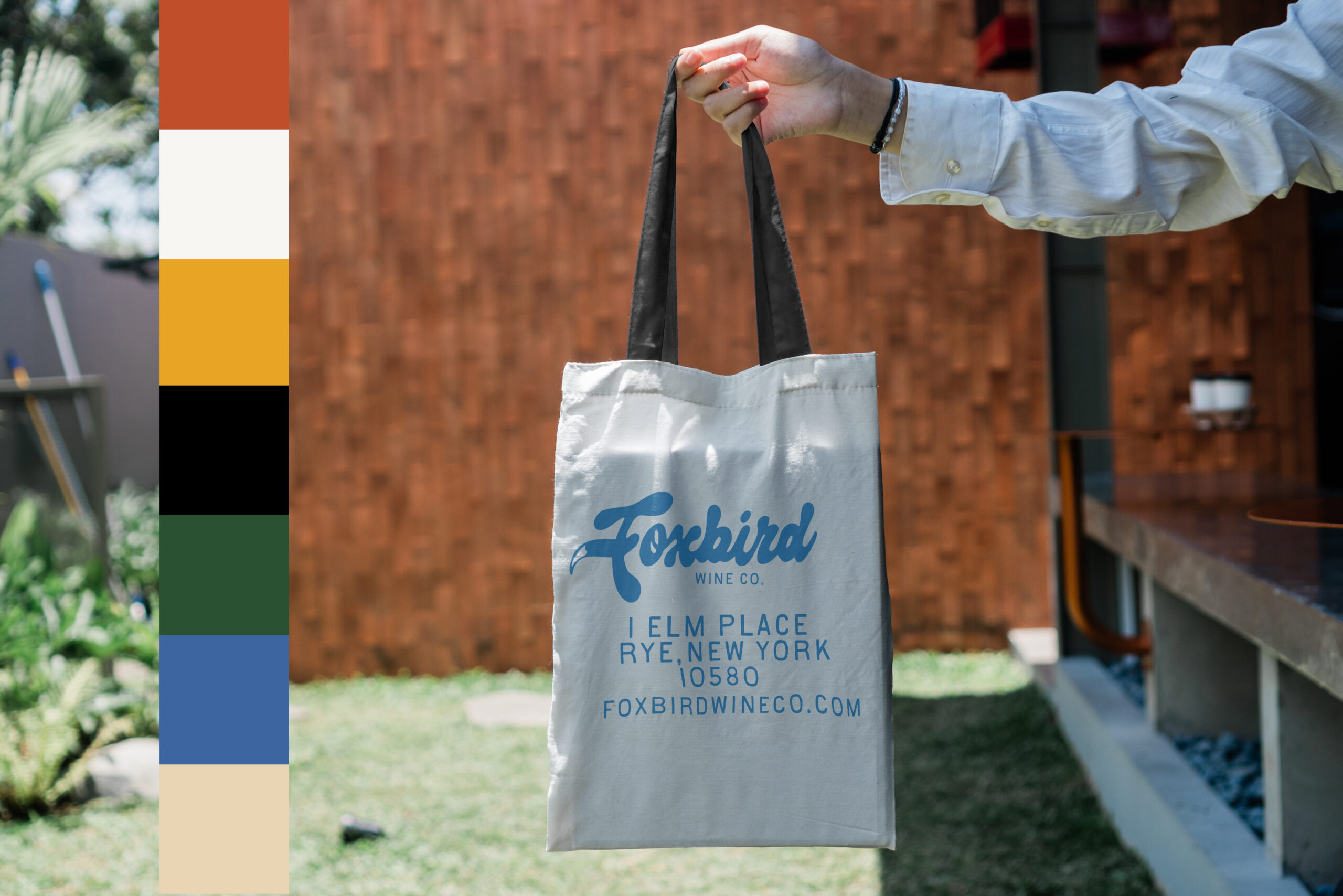
The typeface needed the same care. We started with a handful of faces from our favorite type designers, but nothing off the shelf had the right nuance, so we ended up hand-drawing the lettering ourselves to get every detail exactly right. We ran multiple rounds of exploration and client review, from those early type studies down to three distinct color palette directions, before landing on a warm, grounded “Forest Funk” system that felt as true to the shop as it did to the town of Rye itself.